


ETF Maximizer - Performance
ETF Maximizer was developed specifically for managing accounts with Exchange Traded Funds (ETF's).
Since ETFs can be utilized in virtually all brokerage accounts they are the idea vehicle for investing money that is outside of retirement accounts which may have restrictive choices of mutual funds. ETFs offer an ease of trading with typically lower fees than mutual funds and trade with the price efficiency of stocks. Because they have more components than stocks they offer a nice built-in risk diversification feature.
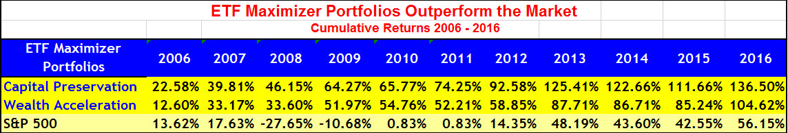
A big benefit of the ETF Maximizer Newsletter is that when markets drop like they did in 2008 our systems outperform. In fact during that time the S&P was down by 38% while both our Capital Appreciation and Wealth Acceleration recommendations made money for subscribers. Quite an outstanding feat -- and a clear example of the value of solid analytic-based investing.
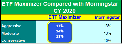
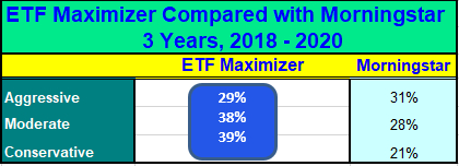
Here are the results for the last 11 years of the ETF Maximizer Portfolios. Our published recommendations started in 2010. Please note how much higher the returns are for both ETF Maximizer portfolios than the overall market.
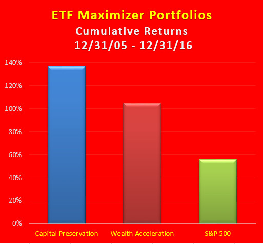
ETF Maximizer Cumulative Returns 12/31/2005 - 12/31/2016
It’s easy to get started, just visit www.ETFsMaximizer.com and click on Subscriber Now.